Slides for our final presentation available here…
Month: April 2014
GA 6.1. User interface prototypes
After testing our user prototype, we created graphical version of our UI. We tried to address all the problem that occurred during testing the paper one:
- Instead of two icons in top toolbar, we used one text button log in, also after user logs in, there are no icons for content manager, profile and logging out but again text
- The same change was done with confusing buttons edit and delete, now there is text button
- The add button in content manager was too small, therefore it was enlarged and is now the main graphical element on the page
- The log in screen was changed little bit
Here are the screenshots of all the element that were created as paper prototype, it is wort mentioning, that after the conversion to jpeg, colors suffer a little bit. Also the pictures used in filters are not very artistic, but I tried the best I could…
-

- Main screen
-

- Log in screen
-

- Add new place screen
-
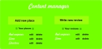
- Content manager
-

- List of places after search
-

- List of places with a filter turned on
-

- top toolbar after user bambusekd signed in
GA 5.1 Testing paper prototype
Our paper prototype was tested by 5 people. Each person came across different problems using our GUI and had different comments to the layout or design of the application.
Most important issues were the following:
- There are two icons in the top toolbar, one for registering, one for logging in. It was proposed to make only one icon. Also the graphical design of icons was confusing.
- In the content manager, the edit and delete buttons again had confusing graphical design
- The form for filling in the information should be divided or done differently
- Some subjects said, that too much space is wasted by the map. We have to note here that this was what other subjects said it is a good design.
- All the graphics as map/pictures should be on the left side and the text on right side
Here we present each testing person which issues mentioned, referenced to the list of issues.
